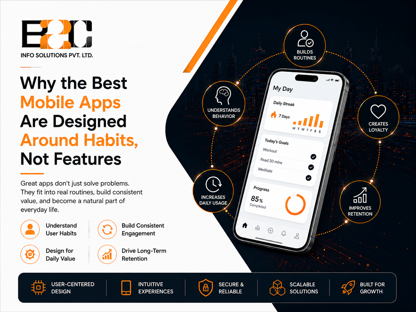
Many app owners assume that adding more features is the fastest way to keep users engaged. In practice, daily-use apps such as fitness trackers, banking tools, and productivity platforms often succeed by fitting naturally into users' routines rather than simply accumulating more features. This is why a mobile app development company in the USA that pays attention to user behavior can help teams build products that are easier to use and more focused than feature-heavy alternatives, since behavior-focused design encourages prioritizing the experiences most likely to support repeat use.
This article looks at why feature quantity alone rarely creates sustained engagement, what is understood about habit formation, and how founders and product teams can design for repeat use without turning their app into a notification-heavy distraction.
It is tempting to think that users compare apps the way they compare washing machines, by counting specifications. In reality, early user experiences have a major influence on whether people continue using an app, and that early impression is rarely based on how many tools it offers. A cluttered interface with fifteen features can perform worse than a simpler one with three, because every extra option adds a small amount of cognitive friction.
Retention data across mobile app categories shows that early engagement and continued usage are important indicators of product health, although benchmarks vary significantly by category and use case. A finance app, a fitness app, and a messaging app are not expected to be opened with the same frequency, so no single retention pattern applies evenly across all of them. What tends to hold across categories is that a feature can be copied by a competitor within weeks, while a routine a user has already built around a product is harder to displace.
Habit formation can be influenced by repeated behavior in consistent contexts, and many apps deliberately design around triggers, actions, and rewards to encourage repeat use. It is worth being cautious here, since there is no single universal timeline or mechanism that guarantees a habit will form.
A trigger is whatever prompts someone to open the app, whether that is boredom, a notification, or a specific time of day. The action is the small, low-effort task the app asks the user to complete, such as logging a meal or checking a balance. The reward is what the user gets back, which could be progress, information, or a sense of accomplishment. When these elements are well aligned, they can make repeated use easier and more likely, particularly when the behavior provides clear value to the user.
Apps that skip this loop entirely and rely purely on adding functionality often produce a strong first impression followed by a decline in usage, since there is little built-in reason to come back.
People use apps in different situations and states of mind. Designing around context, such as the user's time of day, location, recent activity, or immediate goal, can make an experience feel more relevant. A meditation app that softens its interface late at night, or a budgeting app that sends a reminder before a weekend rather than after money has already been spent, is an example of designing for context rather than relying on a fixed, one-size-fits-all schedule.
The two approaches are not strict opposites, but they start from different questions, and that difference shapes many of the product decisions that follow. Some products genuinely need extensive functionality. Enterprise software, financial platforms, healthcare systems, and professional tools often carry substantial feature sets because users need that depth. The distinction is less about how many features exist and more about whether those features support what users are actually trying to accomplish.
A feature-first approach often starts with what the product should be able to do. Roadmaps may then grow around new modules, integrations, settings, customer requests, or competitor activity. This can work well for tools where functionality is the main selling point, though for consumer apps it can sometimes lead to interfaces that feel busy to first-time users.
Habit-first teams ask a different question: What is the one behavior we want a user to repeat, and how do we make that behavior easier every time? Everything else, including onboarding, notifications, and visual design, is then built to support that repeated action. This is one of the reasons an experienced app development team will sometimes recommend a narrower first release built around one core behavior, rather than launching every requested feature at once.
The first session has a significant influence on whether a habit ever gets the chance to form. Apps that ask for excessive information upfront, or that bury the core action behind several screens, tend to lose new users before the loop even begins. An onboarding flow that gets users to a meaningful first result quickly can reduce friction compared with an onboarding experience dominated by feature tours.
Small, visible signs of progress, such as a completed streak, a percentage bar, or a short confirmation message, give users a visible signal of progress and a reason to return to the experience. These rewards tend to work best when tied to genuine progress rather than arbitrary points, since users often notice when a reward feels hollow.
Notifications are one of the more easily misused tools in mobile design. Sent at the wrong time or with generic wording, they can lead users to ignore or disable them entirely. This is broadly consistent with current platform guidance, including Apple's Human Interface Guidelines, which recommend using notifications carefully, avoiding repetitive alerts, and matching interruption levels to the importance of the information.
A well-timed, relevant reminder can be more useful than repeated generic notifications sent on a fixed schedule. Behavioral data collected from past sessions is generally more useful here than a rigid notification calendar.
A message referencing a user's own recent activity, such as a nearly completed goal or an unused feature relevant to their behavior, tends to feel like a nudge rather than an interruption. Repeated generic messages can increase notification fatigue and make users more likely to reduce or disable notifications altogether.
Many language-learning apps use short daily lessons, progress indicators, streaks, or reminders to encourage repeat engagement rather than competing primarily on how many languages they offer. Fitness apps may similarly rely on simple logging flows and progress tracking to support recurring use, rather than a dashboard packed with every possible metric. Finance apps often prioritize a clear summary of balances, spending, or savings rather than surfacing every transaction category at once.
These are patterns observed across many apps in each category, not a rule that every successful product follows identically. The common thread is a degree of restraint, choosing a small number of behaviors to reinforce well rather than spreading attention across many features at once.
A team that pays attention to behavioral design does not usually start a project by listing screens. They start by identifying a single action a user should be able to repeat comfortably within the first week or two, then design the interface, notifications, and data structure to support that action. This is one area where working with experienced app development professionals can help, since behavioral design decisions benefit from user research, testing, and experience across different user segments and app categories.
In practical terms, this often means shipping a smaller first version than originally planned, observing how real users behave over the following weeks, and then deciding which additional features genuinely support the core behavior rather than compete with it for attention.
Download counts and star ratings say very little about whether an app has become part of someone's routine. Useful indicators can include Day 7 and Day 30 retention, repeat completion of the core action, session frequency, and the point at which users stop engaging. The right metrics depend heavily on how frequently users are realistically expected to need the product, since a banking app and a daily habit tracker will naturally show different usage patterns even when both are performing well.
Feature quantity alone does not create sustained engagement. Products that make valuable, recurring behaviors easy, relevant, and rewarding are better positioned to encourage repeat use, and a behavior that a user has already built into their routine is far harder for a competitor to displace than a feature on a list. If your team is planning a new app or reworking one that is struggling with retention, it may be worth stepping back from the feature roadmap and asking which behavior your product should be supporting first. Contact us to talk through how a behavior-focused approach could apply to your specific product and user base.
No. While consumer apps rely on it most visibly, internal business tools and B2B platforms can also benefit from reducing friction around the one action employees need to repeat regularly, such as logging time or updating a record.
Not necessarily fewer, but often sequenced differently. Secondary features are frequently introduced gradually once a core behavior is established, rather than presented all at once during onboarding.
There is no fixed number of days that applies to every product or every person. Habit formation varies by individual, behavior, and context. Research by Phillippa Lally and colleagues found substantial variation in the time it took for a behavior to become more automatic, with modeled estimates ranging from about 18 to 254 days. This is why teams are generally better served by monitoring their own usage data over several weeks rather than relying on a fixed number often cited in popular articles.
Yes. Most habit-focused redesigns start with analyzing current usage data to find where users drop off, then adjusting onboarding, notification timing, and the core action flow, rather than rebuilding the entire product from scratch.

 4 North
  52 Cornmarket
  C-25, C Block, 91springboard
 #02 - 161 IMM Building